The homepage is the most important page on your website. It also receives the most visits. Unfortunately, most businesses don’t put enough thoughts and efforts into designing and creating their homepages.
Here are the common mistakes I see on most homepages:
- There are just too much stuffs thrown into the home page and it just ends up overwhelming the visitors.
- The homepage doesn’t tell me what exactly the company do, which types of customers the business serves, and what pain points or problems the products or services solve.
- No call to actions. The homepage doesn’t tell me what I should do next.
- There are no trust and credibility elements.
Since the home page is the most important page, don’t leave the design of the home page up to the graphic or web designer. Designers are only interested in creating cool and flashy designs with little regards to meeting business objectives.
So if your designers insist on making the site look cool, unique, or flashy, you should hit your designer on the head with a hammer and remind your designer that the objective of your website is to generate sales or leads, not to win a design or art contest!
I strongly believe that the marketing person should be responsible for the look, feel, branding, and messaging of the home page. The marketing person should take the lead role and work with the designer, web developer, and copywriter to design and create a high impact home page.
Things to Think About before Creating a High Impact Home Page
Here are the things you should consider and think about before creating or recreating your home page:
- Find out as much as you can about your target audience. What are their demographics (age, sex, education, etc)? What are their pain points, problems, and desires? What do they like and what do they dislike?
- Determine your value proposition and unique selling proposition. Your value proposition and unique selling proposition should address the pain points, problems, and desires of your target audience and should clearly convey why they should choose you over the other alternatives.
- What are the goals and objectives of your home page? What actions do you want the visitors to take after spending some time on your home page?
- Collect testimonials from satisfied clients and endorsements from third parties. They are important for building your credibility.
After you have gone through the above important exercise, you are ready to start putting together your high impact home page.
Follow the steps below:
Do a wireframe of your design
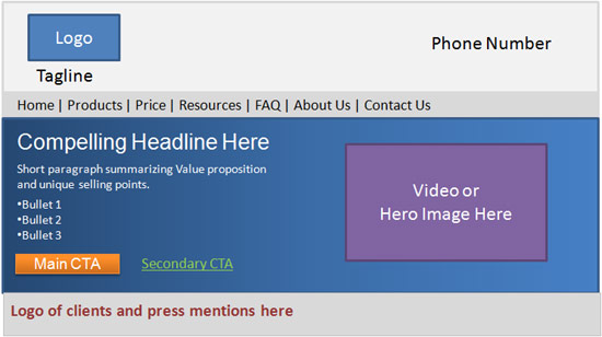
By doing a wireframe first, you have a blueprint of how the layout of your site should look like and where to position each feature and element. Your wireframe or mock up should include the following elements and features:
- Logo and tagline – The logo and tagline should occupy the top-left position of your home page. A tagline is a short, catchy phrase that provides the visitors with further information on what exactly your business is about. It is positioned close to the logo, usually directly beneath the logo or on the right side.
- Your value proposition and unique selling points as captured by your headline, subheadline, a short paragraph, and some bullets.
- Credibility elements – Testimonials, press mentions, case studies
- Trust elements – BBB seal, Industry association seal, Site security seal and certificate
- Call to Actions
Now that you have your wire frame done, let’s put them together.
Use Design Best Practices to Create an Attractive and Professional Looking Site
The look and feel of your site must be attractive and professional looking. Visitors will make a split second judgment of your site and determine whether they should stick around or leave your site based on the look and feel of your homepage.
Follow these guidelines to create a professional and attractive looking design:
- Make sure that the design of your logo is professional looking. The logo represents the brand and image of your business so you should hire a professional logo designer to design a logo that best represents your business. A good resource to use if you need a professional designer to design your logo at a reasonable cost is 99Designs. A logo can be just a text based logo like the this logo for Hollywood actor Candice Dylan.
- Choose 2 colors to be the dominant colors for your design. Ideally, these 2 colors should be based on the colors of your logo and should appeal to target audience. Next, choose 2-3 additional colors for the background and call to action buttons. These colors should work well together to provide a pleasing experience. You can refer to colourlovers.com and colorschemedesigner.com to get ideas to select the appropriate color scheme for your homepage.
- Use clean layout with adequate white spaces – A clean layout is elegant and pleasing to the eyes. A cluttered design can quickly give your visitors a big headache. So, use adequate white spaces and don’t try to cram everything into your home page. Only include the essential elements and features.
- Avoid flash, distracting backgrounds, slide shows – These elements add little value and are distracting.
- Use attractive typography – Typography can make a big difference on the design. Using appropriate and high quality fonts can instantly improve the attractiveness of your home page design. You can get high quality fonts from sites such as fontsquirrel.com and fonts.com
Convey Your Value Proposition using Compelling Headlines and Concise and Clear Messages
You only have a few seconds to let the visitors know that they are in the right place and that your site has something worth looking further. As such, your value proposition must be clear and compelling.
You can communicate your value proposition and unique selling points using a combination of the headline, the subheadline, a short paragraph, and a few bullet points. The headline and/or subheadline should contain the keywords related to your business and should convey a compelling value derived from the experience provided by your business.
In addition, you should have 1-2 paragraphs of texts and bullet points to answer questions like who your business serves, what problems do you solve, what makes you special or better than the competition, and what your target audience stand to lose by not using your products or services.
Your value proposition and USP should be at the forefront of your website and above the fold, where visitors are able to see it right away.
Establish Credibility And Trust
Since most of your visitors have never don’t business with you, they want to know if they can trust you or not. To convey trust and credibility you should include the following elements on your website:
- Show logos of clients that you have worked with.
- Show off any press mentions and awards that your business have garnered.
- Include testimonials from some happy clients. Video testimonials add even more credibility. If you can’t get video testimonials, you should try to include photos of the clients that are giving the testimonials.
- Include links to case studies. Case studies are recommended if you provide a product or service that is complicated and require heavy investment from your clients.
- Display seals and certificates such as BBB (“Better Business Bureau”) and any other industry association seals.
- If your site collects private information, you should display site security badges from Verisign, McAfee, or Trust-e.
- Include your phone number on the right side of your header area.
Show Off Your Products with an Image or a Video
An image or a video on top of the fold is important to give the visitors a visual representation of your products. If you sell physical products, you should take professional photos of your products and show an image or two of the products. If you sell a SaaS product, you can show a screen shot image. If you have a very complicated product, you may want to use a video to provide a quick demo of how your product works. The length of the video should be 30 – 90 seconds.
Lead Your Visitors to the Next Steps with Appropriate “Call to Actions”
Alright, now that your visitors know what you do and why they should check you out, what do you want them to do next? You must provide them with clear “Call to Actions” to lead them to the next steps.
One thing you must avoid is having too many “Call to Actions” with equal weight. If you give the visitors too many choices, it lead to a phenomenon known as “paradox of choice.” What this means is that when you give someone too many choices or options, that usually leads to paralysis of the mind and results in no actions taken.
You can have one or two “Call to Actions”, but you must have only one primary “Call to Action.” You should use the most prominent colored button for your main CTA and a less prominent colored button for the secondary CTA. Your secondary CTA could also be just a text link.
Examples of “Call to Actions” include:
- Sign up for free trial
- Request free consultation
- Learn more
- Get a tour
Depending on your products and your audience, you must choose appropriate CTAs. Pushy CTAs such as “buy now” or “sign up now” usually are not as effective, because the visitors do not have enough information or data on your business to fall for such aggressive CTAs.
Other Features You May Want to Add
Depending on your business, you might want to add the following features:
- List of upcoming events – If your company organizes or participates events that are useful to your customers and prospects, you might want to list these events on the homepage.
- Free offers for your white papers, Ebooks, or Slides.
Leverage Analytic and User Testing Data to Continuously Improve Your Home Page
Your home page design should evolve and change over time as needed. Do user testing and leverage Google Analytics data to improve your home page. Look at the bounce rate data and find out what people click on and what people don’t click on.
If there are certain features or elements that never get clicked on, you might want to remove them.
Examples of Home Page Well Done
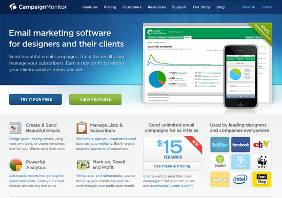
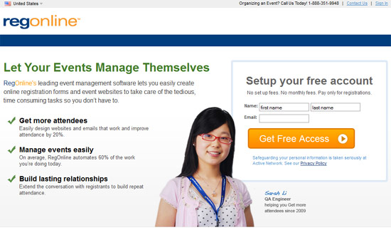
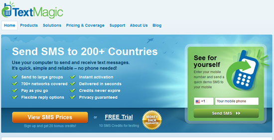
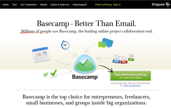
To give you some inspiration, here are examples of home pages incorporate the best practices as discussed above.
1. CampaignMonitor.com
2. RegOnline.com
3. Textmagic.com
4. Basecamp.com

